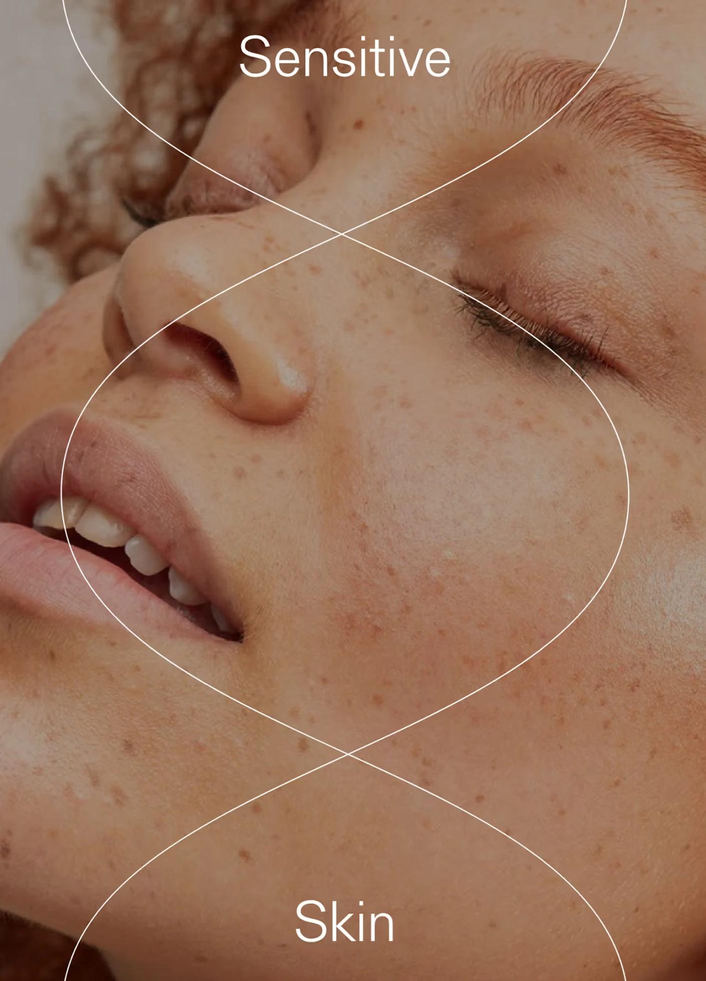
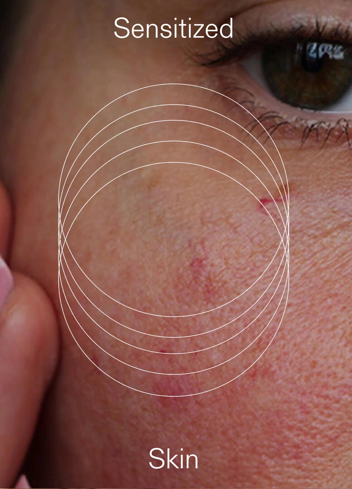
The sensitive skincare brand seeking renewal.

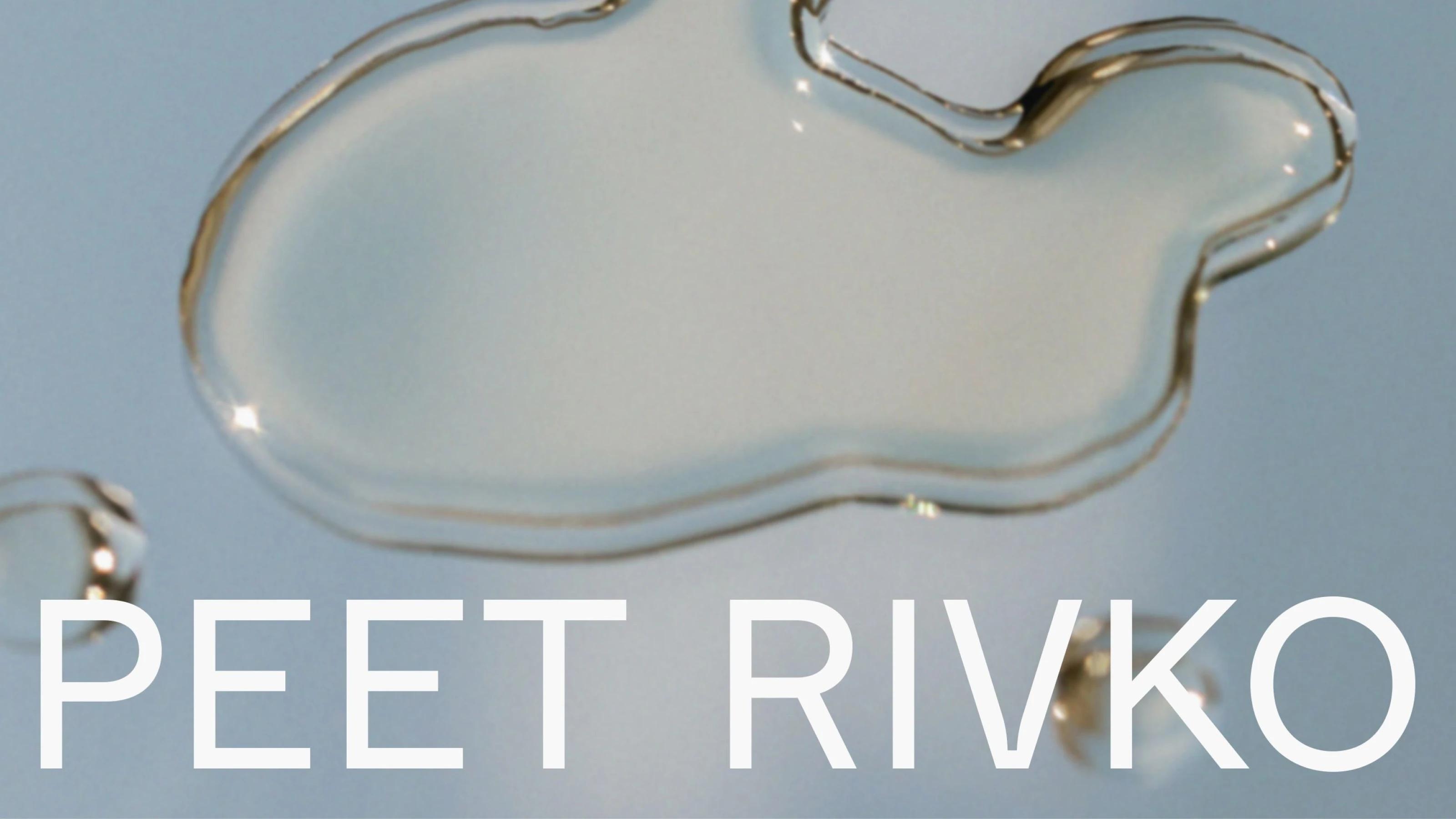
Peet Rivko
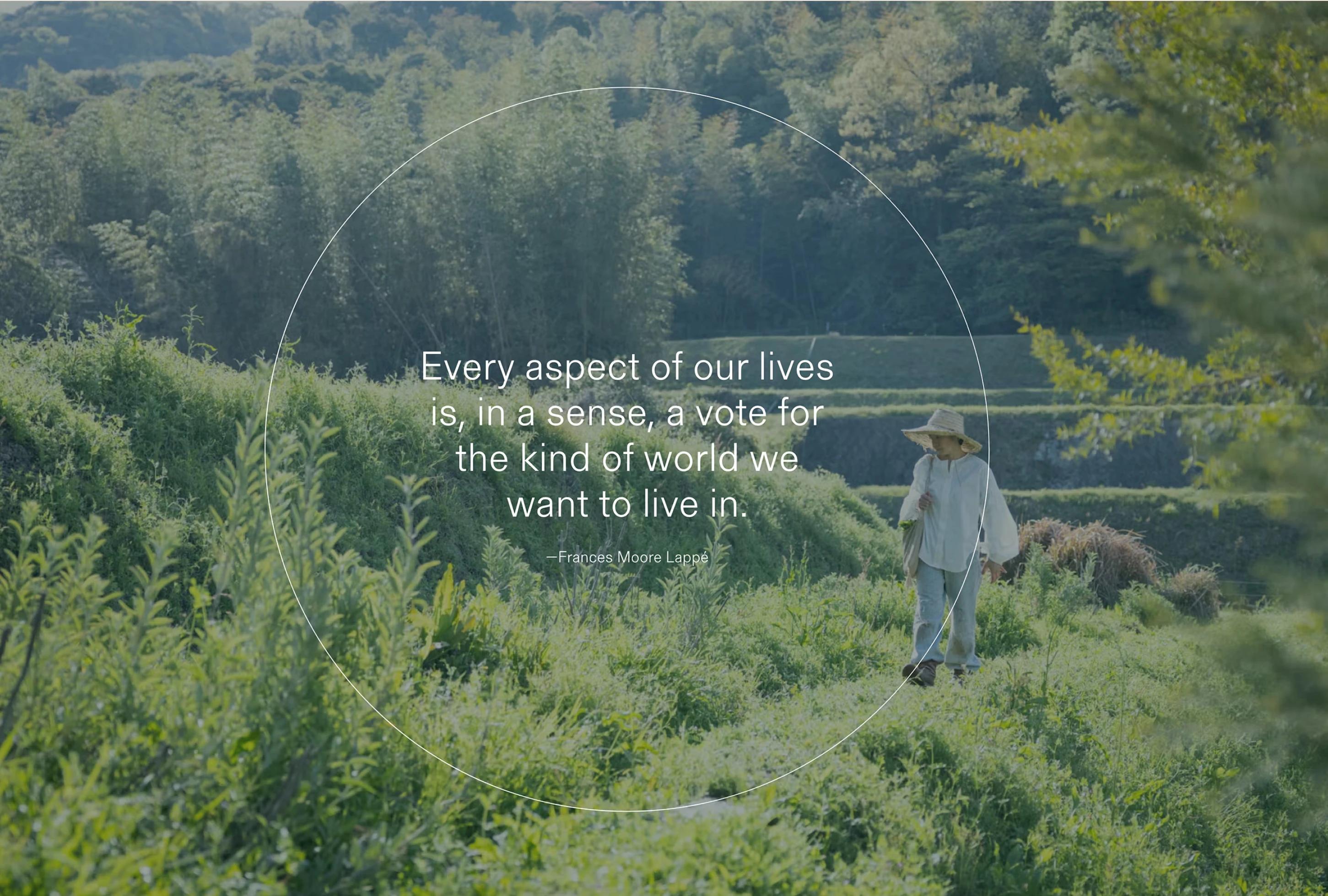
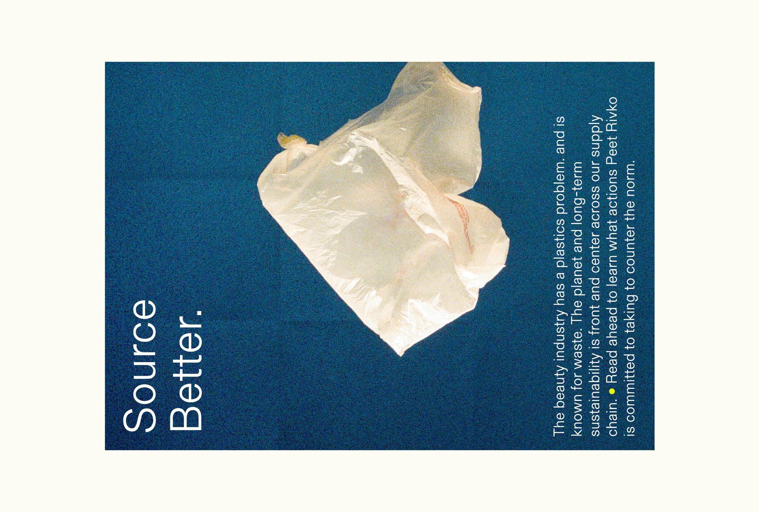
Since their start, Peet Rivko has led with their values–championing inclusivity, sustainability, and a holistic approach to skincare–and needed a brand that reflected just that.
While the Peet Rivko team ultimately decided to close the doors of their beloved business, we’ll always remember this collaboration fondly. Below is a glimpse of our work with their incredible team; a cherished time capsule that reminds us that great things can happen when thoughtful minds meet.

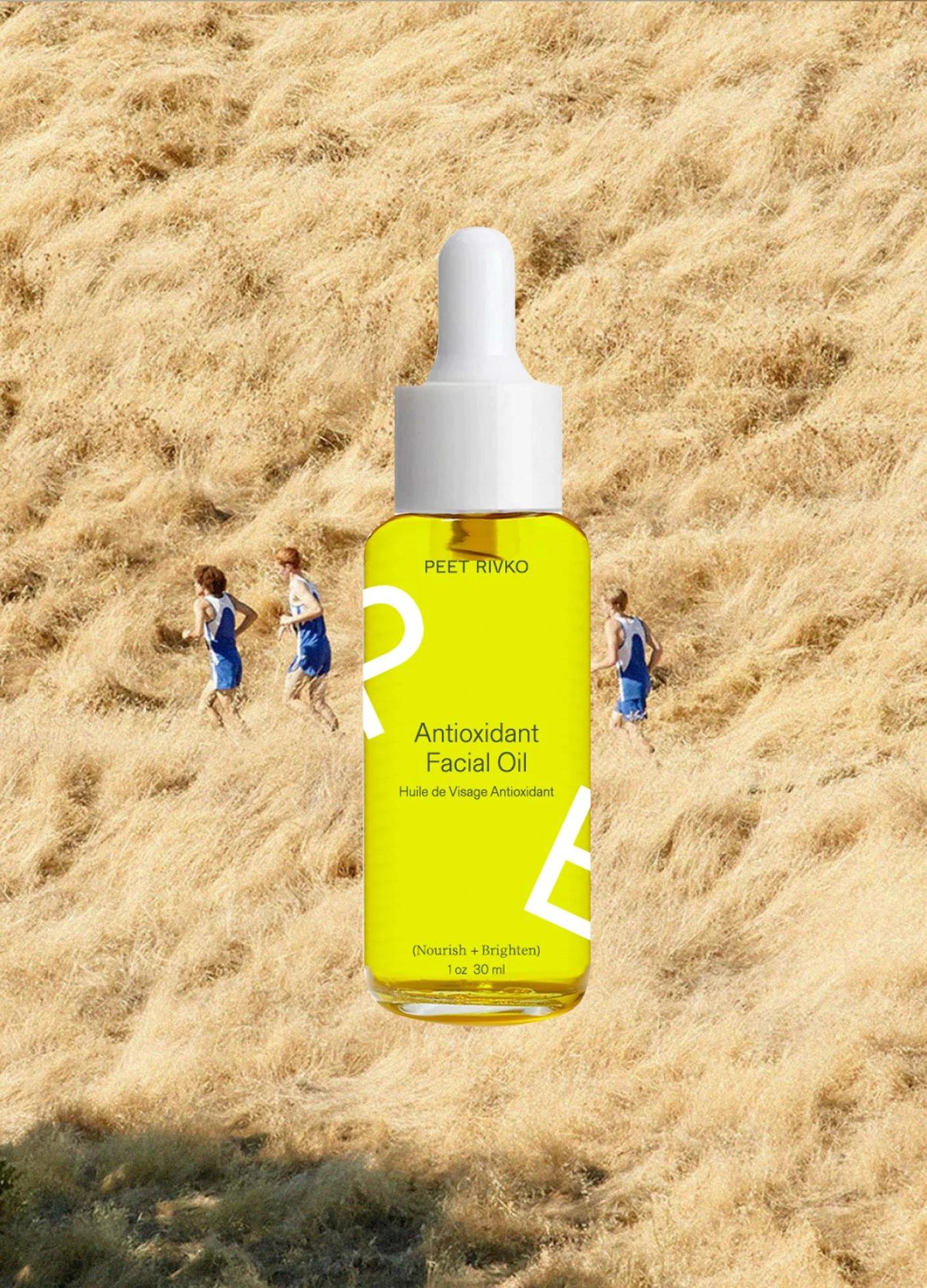
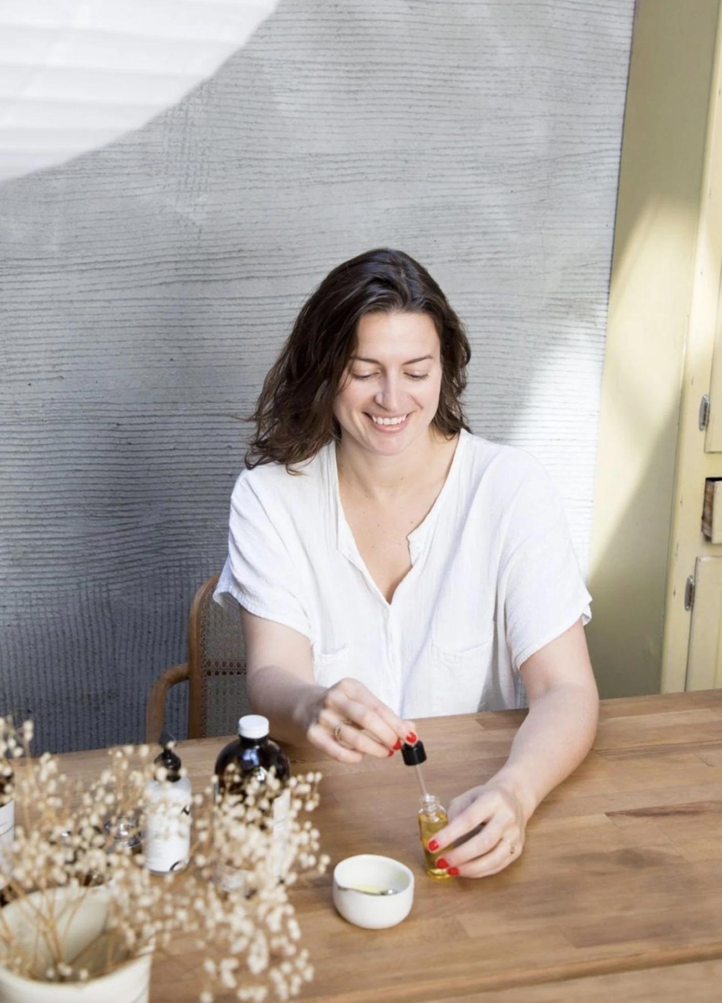
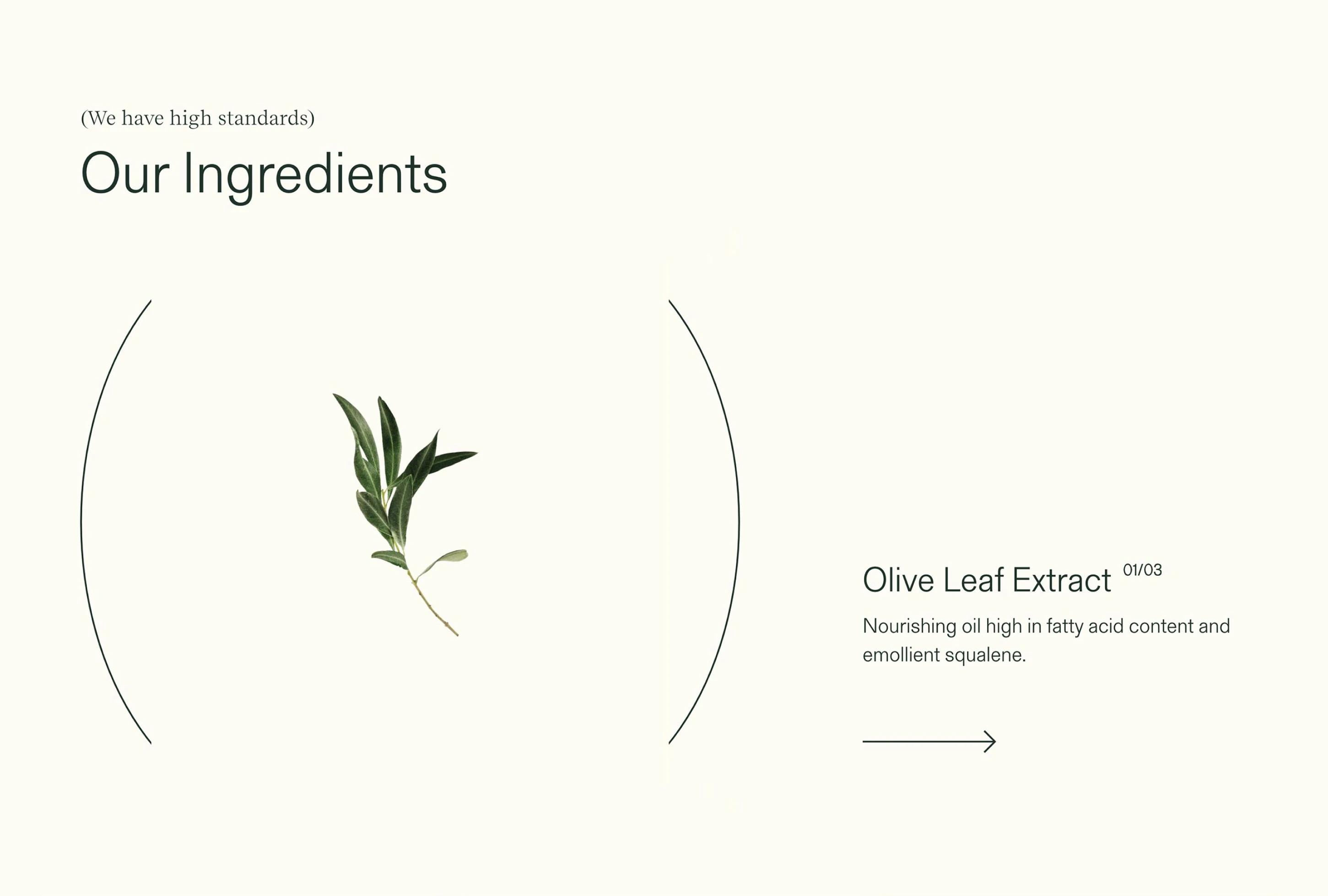
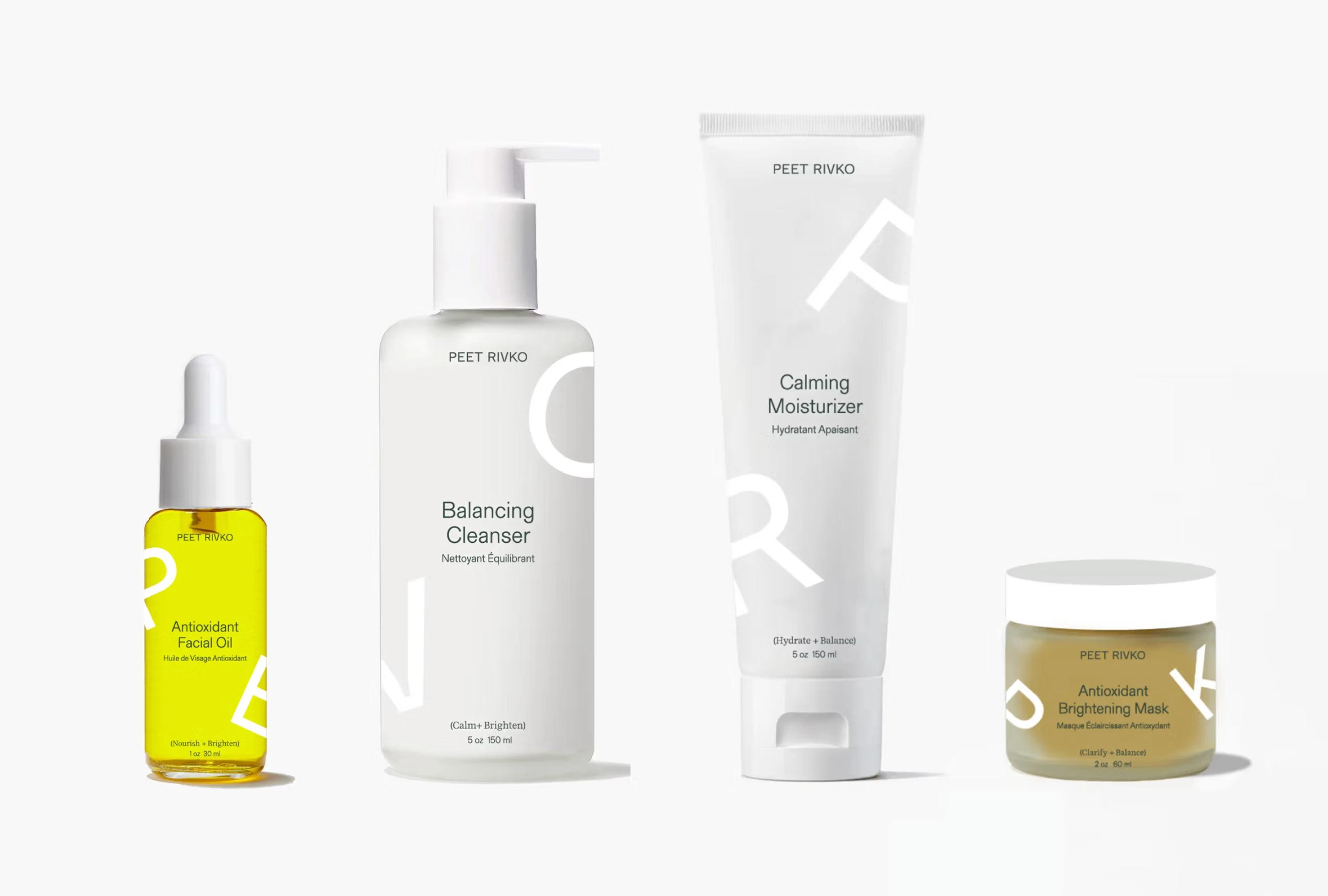
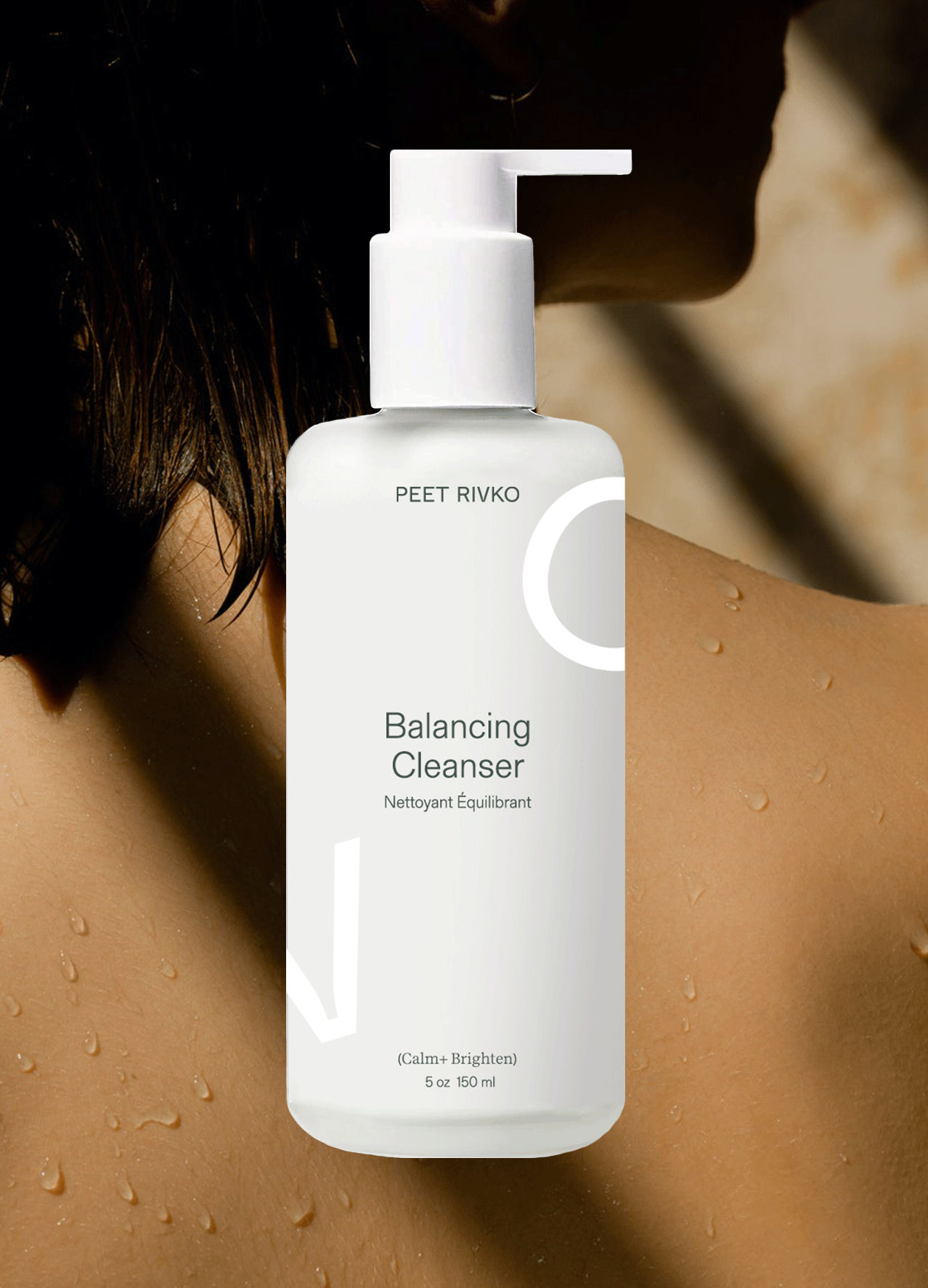
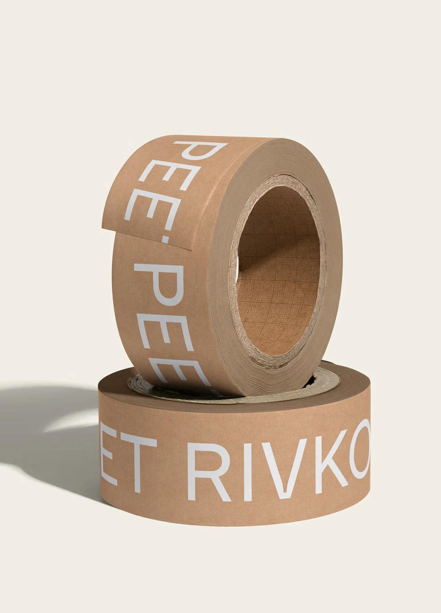
Peet Rivko’s branding balances strength and neutrality to appeal to all genders. We designed a bold, custom sans serif logotype with a touch of personality. A fresh color palette, minimal graphics, and playful messaging reinforce the modern, minimalist identity.
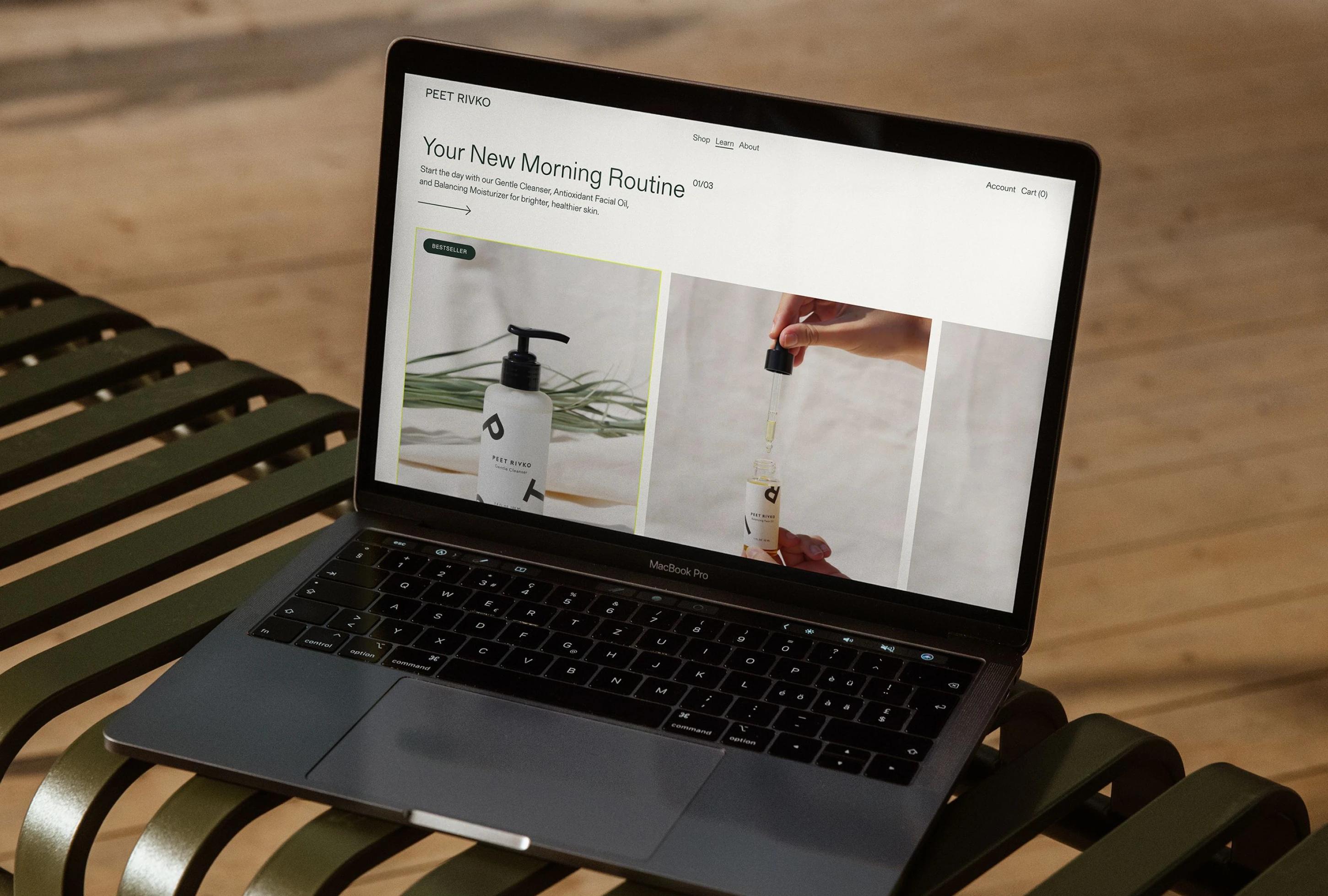
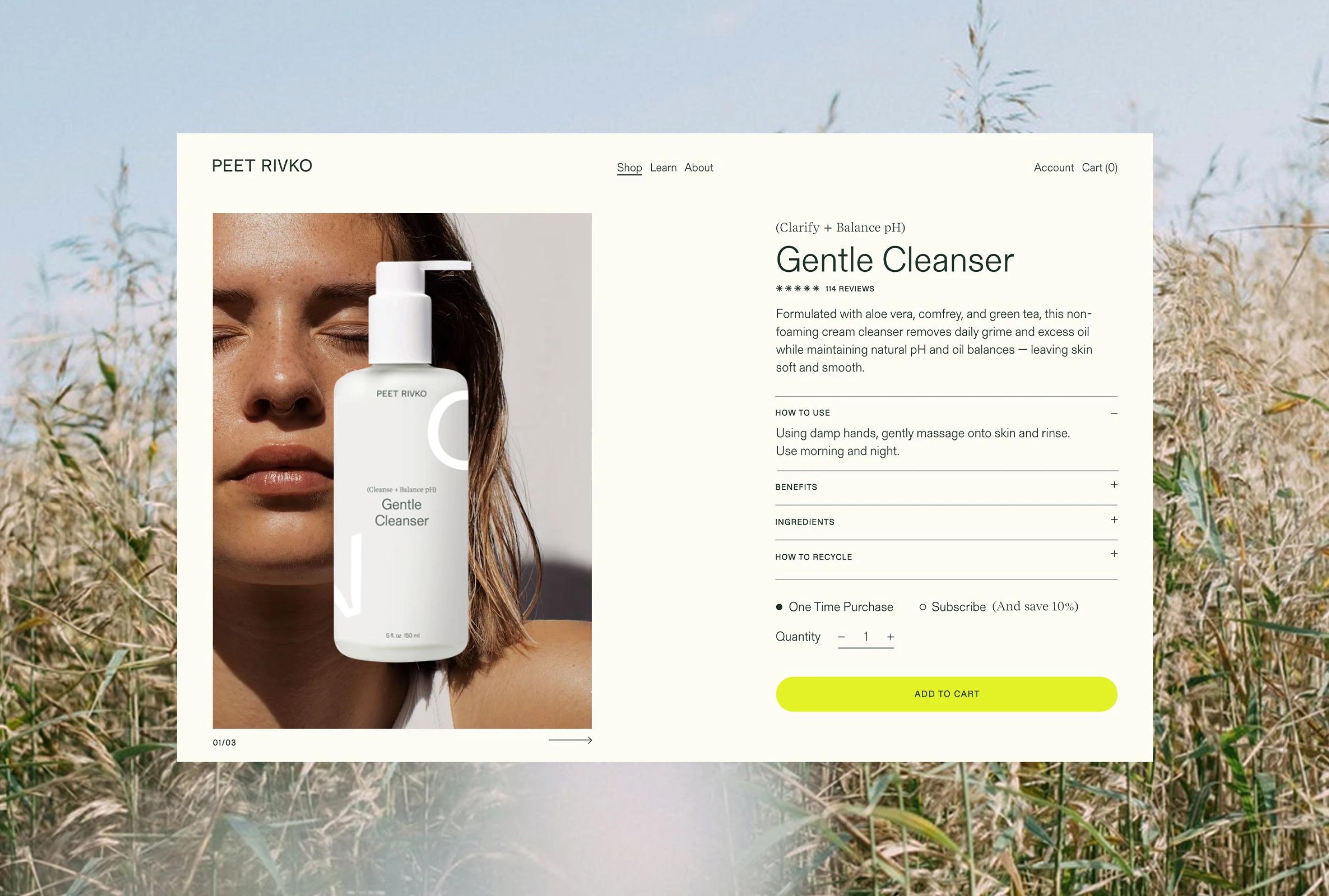
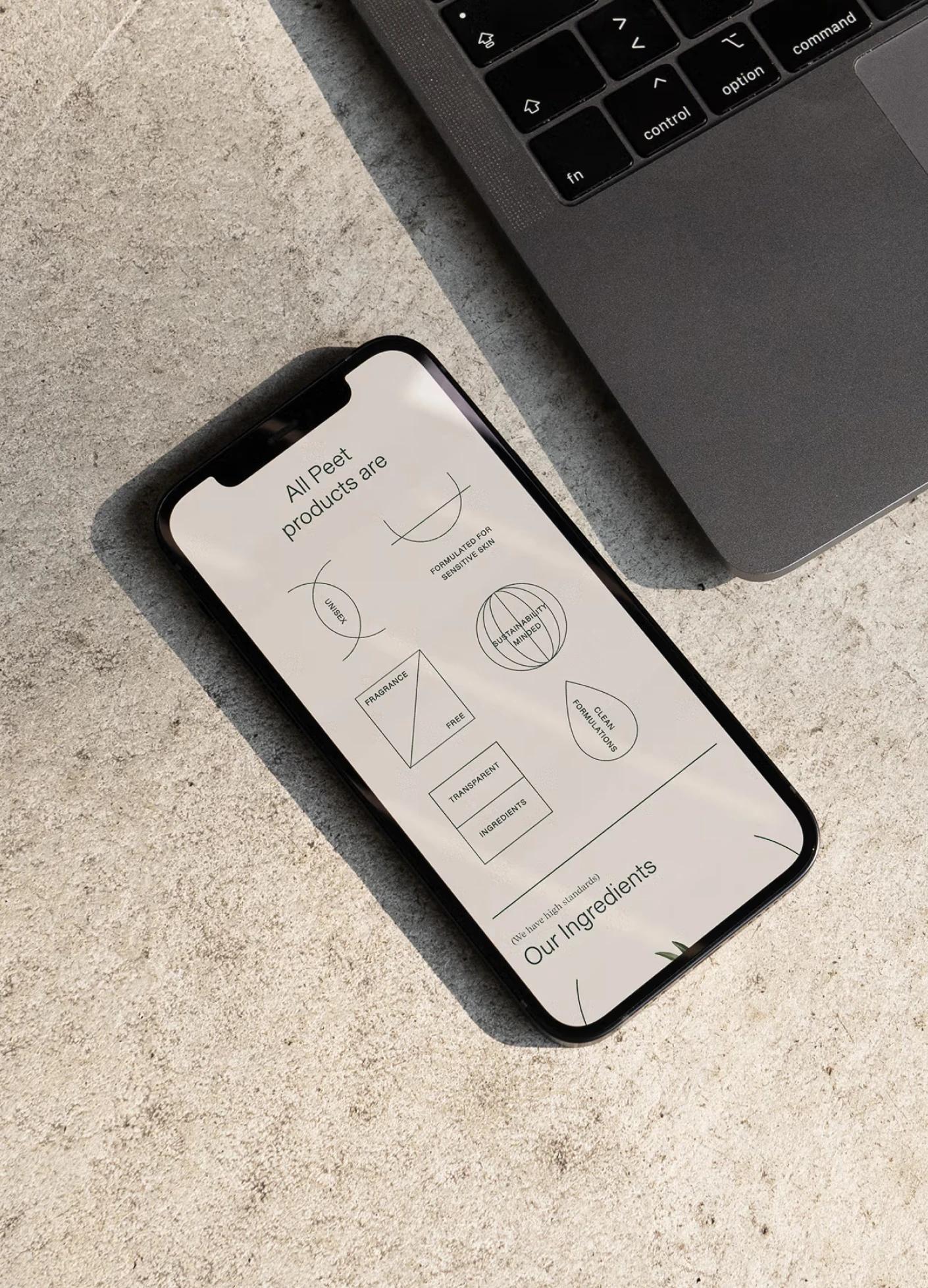
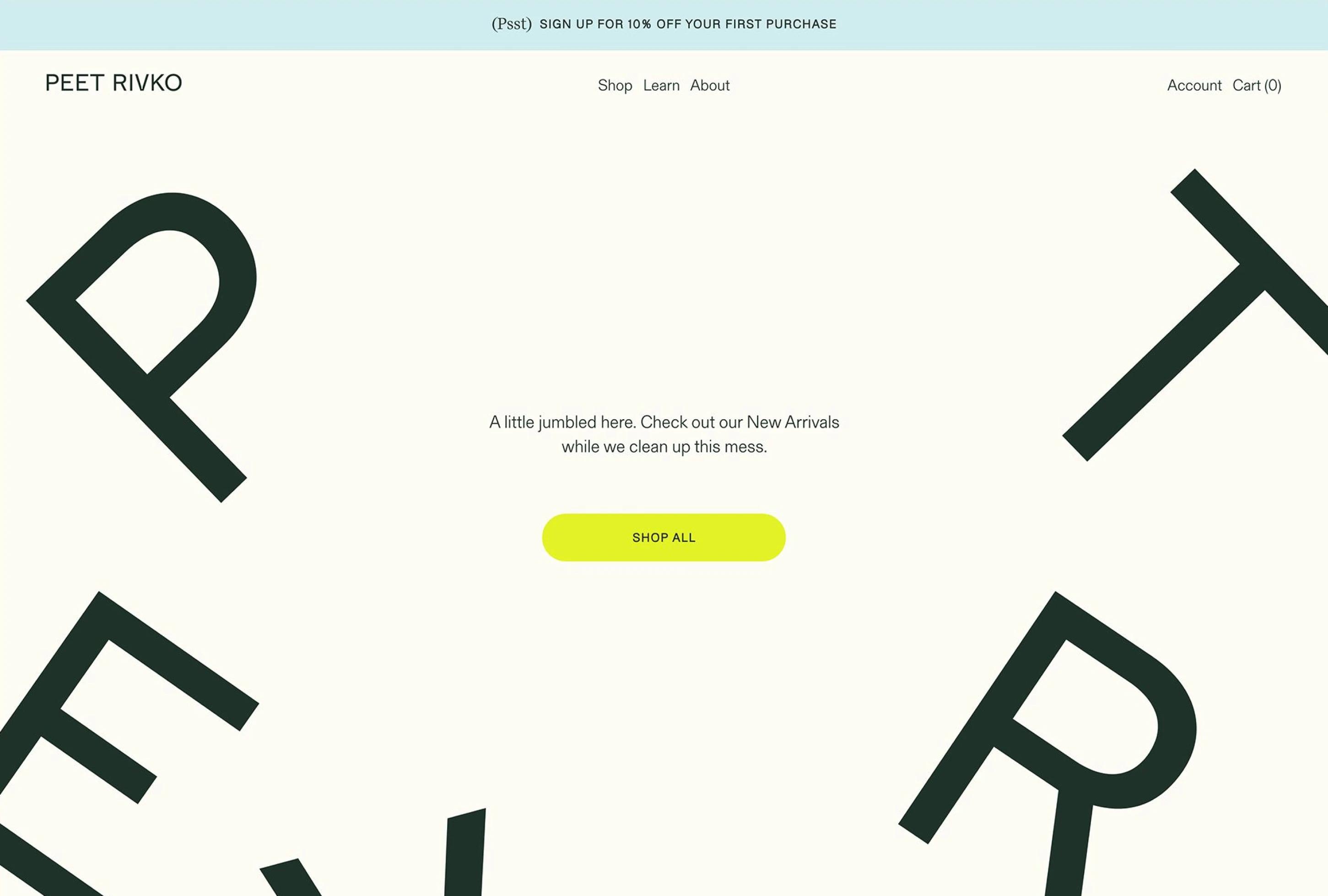
We designed a completely custom Shopify e-commerce experience for Peet Rivko resulting in a clean, minimal website with personality infused throughout. We prioritized an intuitive shopping experience along with opportunities to deep-dive into educational content.
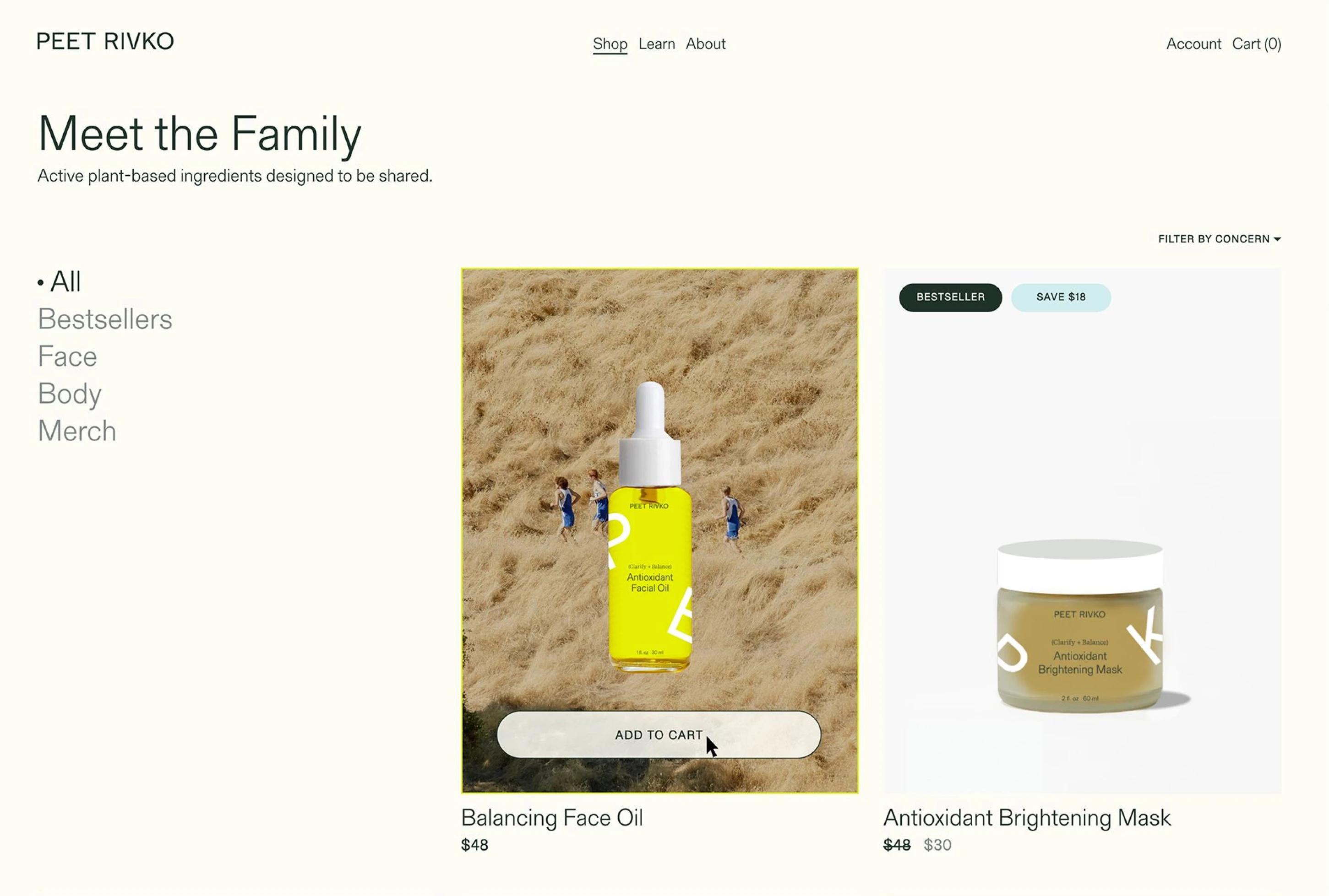
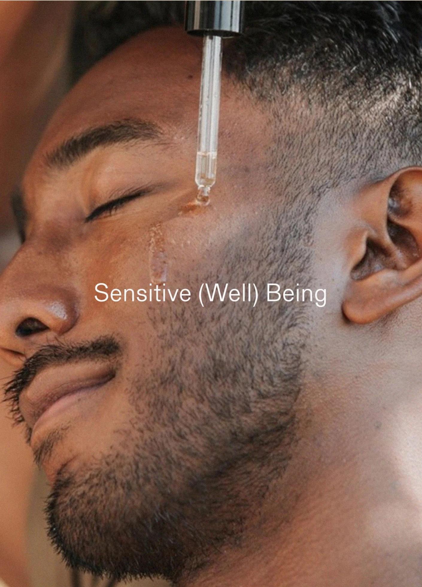
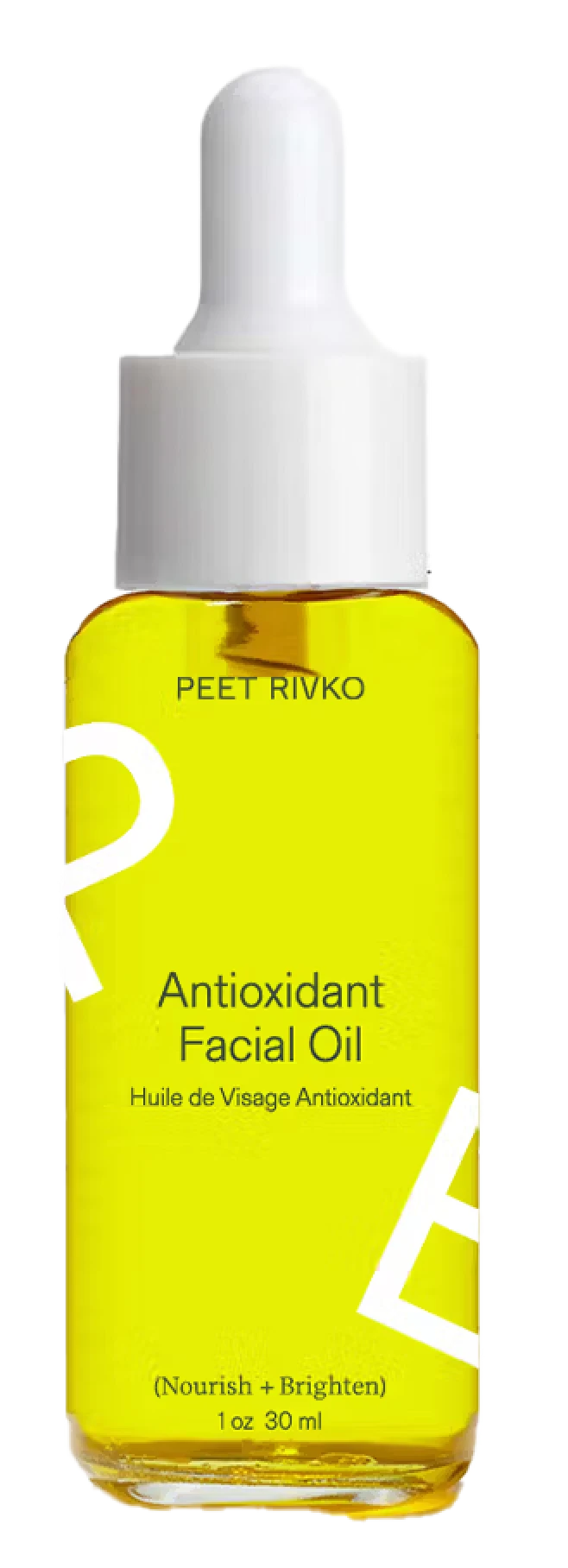
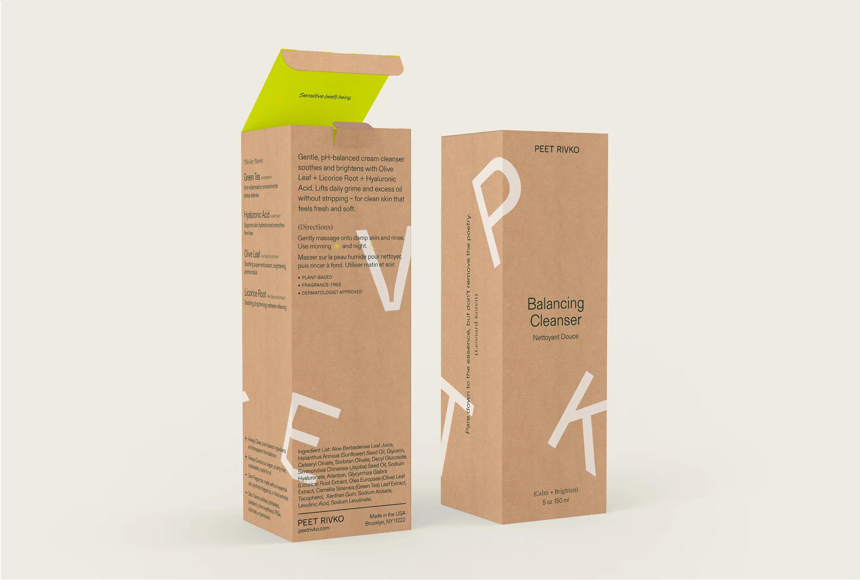
We refreshed the packaging by introducing white and kraft tones to brighten up the palette and signal the use of sustainable materials.
Services
Brand Strategy + Identity
Shopify E-commerce Website Design + Development
Brand Assets
Credits
Photography: xx
We loved working with Joyce and Michelle. They were absolute professionals and went above and beyond with communication, organization, and deliverables at every stage of the process. As clients, they always incorporated our feedback while pushing us to have better, stronger designs and functionality. Could not recommend them more.
— Joanna Peet, Founder